What to Consider when Designing a
Commercial Property
Similar to the human beings who populate them, the presentation of a commercial building is an integral part of creating a positive relationship with your customer base. If an aspect of a design is faulty, there is a distinct possibility that either it won’t be suitable for use or that it sends the wrong signal about your business to those you hope will support it, or both. Having a clear idea of what that signal should be, and how you aim to achieve it, is crucial in maximising your potential for success. From the choice of materials and colours you use to the quality of light and amount of ambient noise, everything makes a difference to how a client perceives their experience, which in turn informs the likelihood of them returning to you in the future – the obvious metric by which any commercial premises’ success is measured. Our principal areas of concern may be windows, doors and lighting, but over the years we have noticed a few things in all aspects of the building industry, so we’ve drawn up a checklist of the things we think are worth considering when designing a commercial space.
The Entrance – What you See is What you Get
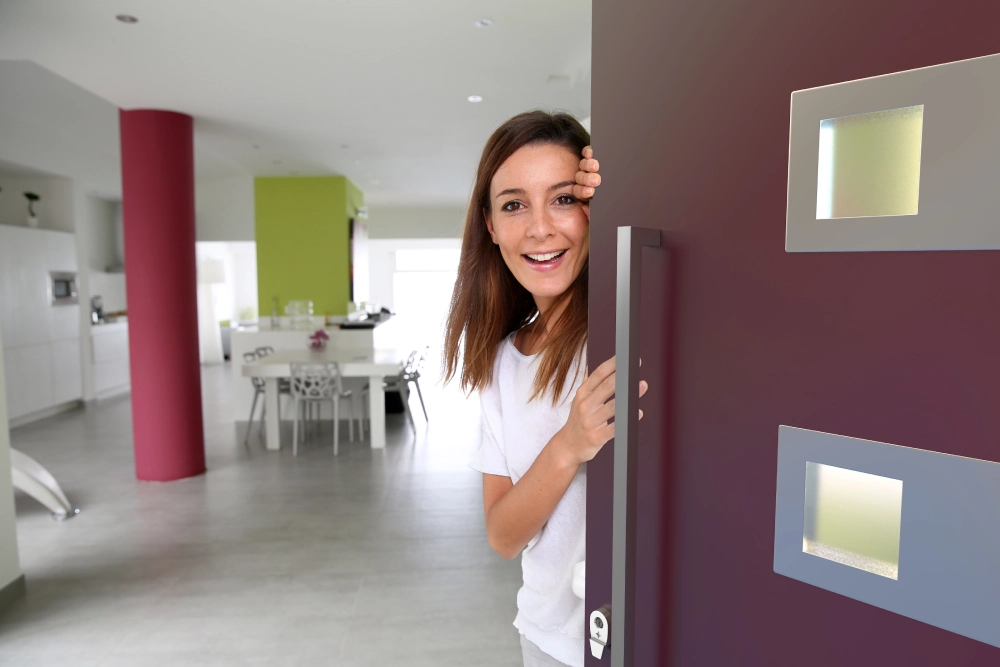
First impressions matter. A quick search of famous quotes on the subject gets you from Cynthia Ozick to Hunter S. Thompson in the click of a mouse. Suffice to say: they’re not wrong. Having a clear image of your identity will go a long way in the pursuit of choosing some of the more individual variables, but whatever your intended market, the design should be inviting, inclusive and clear. Here are some of the things that contribute to this first impression and how you can best control the narrative.
Setting the Tone – Colours and Themes
The face of a commercial property is like the home page of an online retailer. It’s important that the image of the business you are presenting is consistent – or on-brand – with the services or goods being offered. A visibly dirty kitchen would naturally make us think twice about eating at a restaurant; the same logic can be applied to any place of business. If the intention is for a calm, relaxing atmosphere, the colour palette might want to be neutral and the space less cluttered. On the other hand, if the ambience needs a more energised and vibrant feel, bold colours and a busier display might be more suitable.
Materials
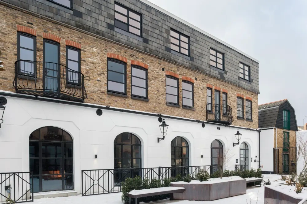
A hallmark of late 20th/early 21st century public spaces is their use of plain, open entrances, with emphasis on glass and metal in the construction of the facade. Think of any recently built arts centre or government building and the concept would be on display. As well as being relatively hassle-free with regards to maintenance, having large pains of glass on a building’s frontage gives the impression of clarity and transparency, and metal of industry and authority. Alternatively, a traditionally painted or treated wall, with signage and on-brand messaging, inspires a sense of charm and homeliness and care. Each of these has positives, but they send very different messages as to the type of business your customers might expect to find inside.
Windows and Doors
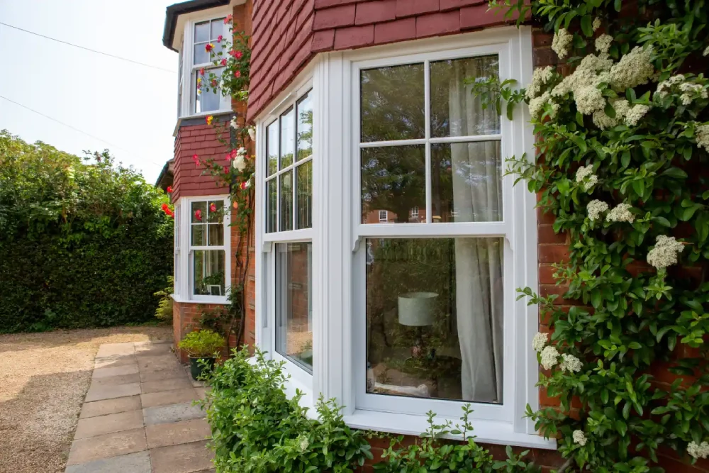
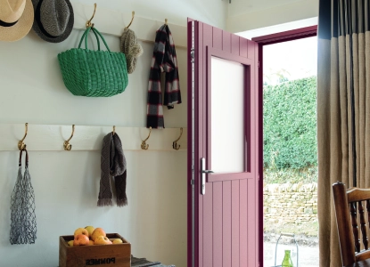
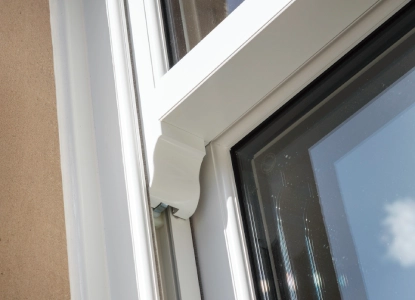
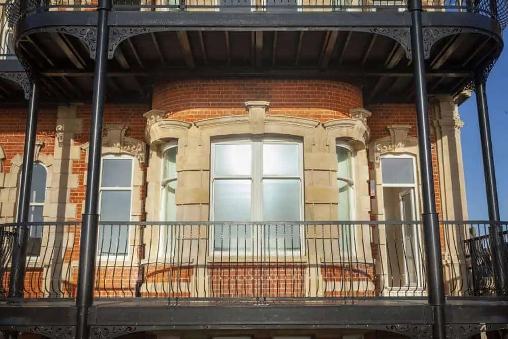
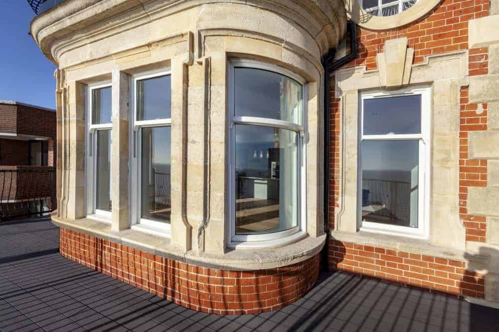
Windows and doors of commercial premises must be many – often contradictory – things at once. They have to be safe and solid but inviting and functional. They have to be durable and weather-resistant but also aesthetically appealing in their own right, as well as ample in their size and positioning – so as to best make use of the natural light and to give your potential clients the best view of the experience they can expect once they cross the threshold. Whether you’re thinking of the secure durability of aluminium or the extra thermal values of uPVC (or you’re still unsure), our well informed and dedicated team would be more than happy to answer any questions you might have, from the pros and cons of particular materials to the compatibility with design specifications. They are an intrinsic aspect of a building’s performance from the inside as well as out, but we will touch on that again a little later on.
Lighting
Another one that is just as important on the outside of premises as it is on the inside. The time of day that a space is open will make a big difference to the types of lighting you use. Despite this, in many contexts – when the building is visible from areas of heavy vehicular or pedestrian traffic, for example – enabling a clear view of the property even outside of the hours of service is a worthwhile move.
Planning, Zones and Permits
This point could easily have been first on the list. Before working on your property, you must ensure that you have obtained all the necessary permits. Councils will not approve any plans until they know that they meet all relevant safety standards and adhere to all of the necessary planning regulations. Planning and zoning regulations are also key areas of consideration. They may significantly alter what you can and can’t do with a space. They might have restrictions on a building’s size or location, too. Local councils have different and ever-changing criteria, so the websites and representatives of the given constituencies will provide accurate information for your specific case. These can be long, drawn-out processes, so getting them done in the early stages of your design is advisable – you don’t want to find out that one part needs changing later on.
Structure and Interior Design
Layout
The way a building is structured can have a major effect on what the space can be used for. Often, commercial properties have more than one business in them, and just as often the ones they do have change, so the utility of a building should be high on the priority list. Does the layout accommodate a wide range of uses? Can aspects be easily changed if the needs of the space shift?
Windows and Lighting
Ample window space reduces the amount of electrically subsidised light needed during the day. If a business operates during daylight hours only, the amount of natural light a space gets can make a huge difference. If the model is based on night trade, windows help with creating an atmosphere and a feeling of being removed from the potential weather extremes, as well as reducing the amount of noise that filters through from the outside environs. At any time of the day, lighting can help focus people’s attention to what you want them to see. We as a species are very sensitive to fluctuations of light, using it in the correct way is an effective tool in the design arsenal. It’s worth saying again – windows, doors and lights are our bread and butter. If there are any questions you have, don’t hesitate to ask one of our professionals for assistance or advice.
Labour
An obvious but all-too-often overlooked aspect. The contractors and engineers you are able to get to work on your plans will dictate what is logistically within your means. Make sure your team is happy with your plans before you commit to it or them. The value of professional, experienced advice cannot be overstated, either.
Now, Get the Ball Rolling…
Designing a commercial property is a complex pursuit, but with a clear image of what you want and a detailed plan of how to get there, it can be a lot simpler than you might think. Like all big challenges in life, it can also come with the biggest rewards.
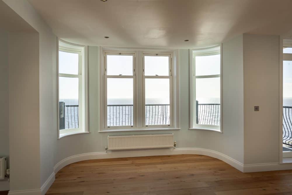
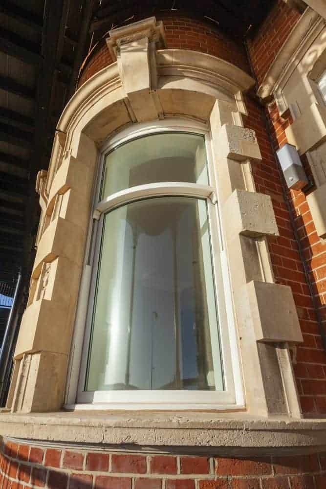
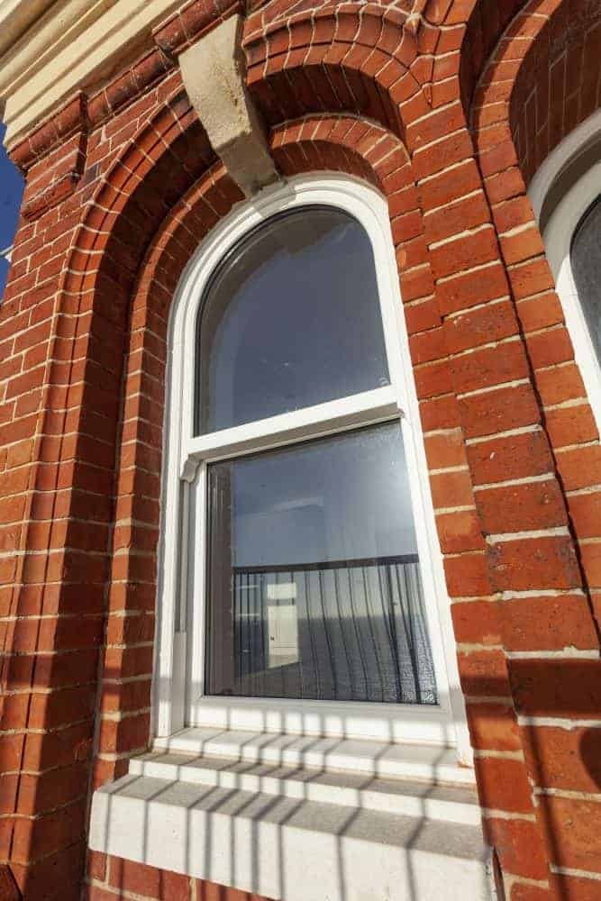
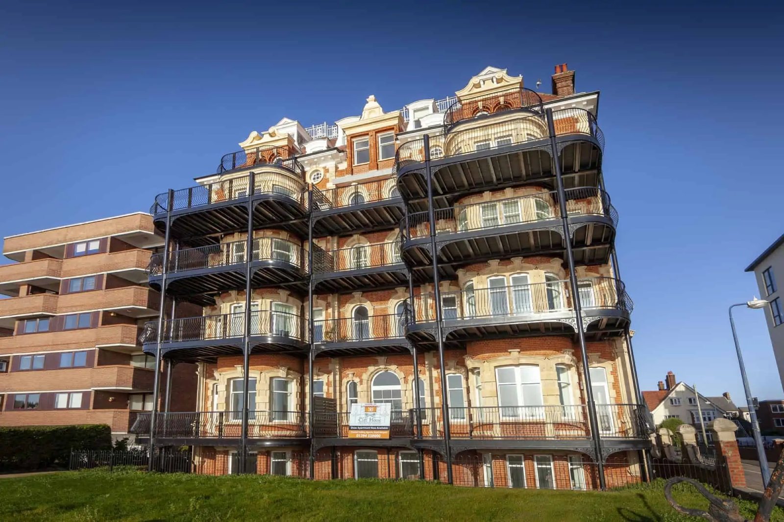
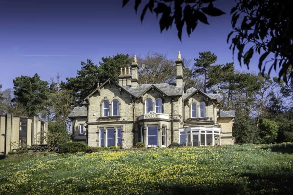
Cliff House, Felixstowe
VIEW PROJECTFoxhill House, Chester
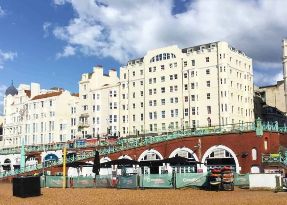
VIEW PROJECTUniversity of Sussex, Brighton
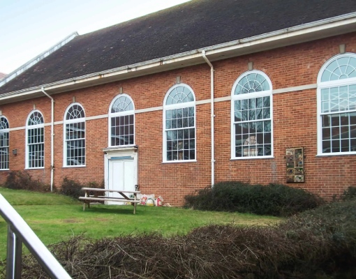
VIEW PROJECTVarndean College, Brighton
VIEW PROJECTFrom sash windows to aluminium bifold doors, our high-quality products are engineered and manufactured right here in Britain. We work with fellow UK-operated companies, Spectus Window Systems, Smart Systems, and Jack Aluminium Systems, to deliver only the very best to our trade, commercial and residential customers.
How much do French doors cost to install in the UK?
The cost of installing French doors in the UK varies depending on the size, material, and design. At Mercury Glazing, we offer competitive pricing tailored to your specific needs. Please contact us for a personalised quote.
How to fit door handles?
Fitting door handles can be a straightforward process. First, measure and mark the position on the door, drill the necessary holes, then attach the handle with screws. For detailed instructions or professional fitting services, feel free to reach out to us.
How to replace patio doors?
Replacing patio doors involves removing the old doors, preparing the opening, and installing the new doors. It's a task best handled by professionals to ensure a perfect fit and functionality.
How much do patio doors cost?
The cost of patio doors varies based on size, material, and design. Contact us at Mercury Glazing for a bespoke quote that matches your specific requirements.
How much are French doors?
The price of French doors depends on the material, size, and design details. We offer a range of options to suit various budgets. Please get in touch for a tailored quote.

